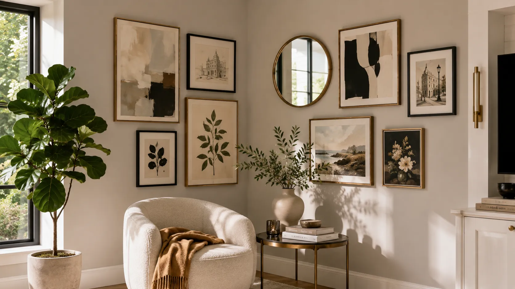
10 Gallery Wall Corner Ideas That Work in Real Homes
Corners are one of those spots in a room that just kind of get ignored until someone points them out and suddenly it is all anyone can see.
You Might Also Like
Most people stick a plant there or just leave it empty and call it intentional minimalism, which is a very generous way to describe neglect.
The frustrating part is that corners actually have more wall surface than people realize, and a gallery wall setup fits there better than almost anywhere else in the room.
Gallery wall corner ideas tend to work so well because the two walls meeting creates a natural boundary that frames everything without needing extra hardware or complicated planning.
None of these ideas require a design degree or a weekend of measuring, just a clear sense of what the space is already doing and what it needs.
1- Start With One Anchor Piece on Each Wall
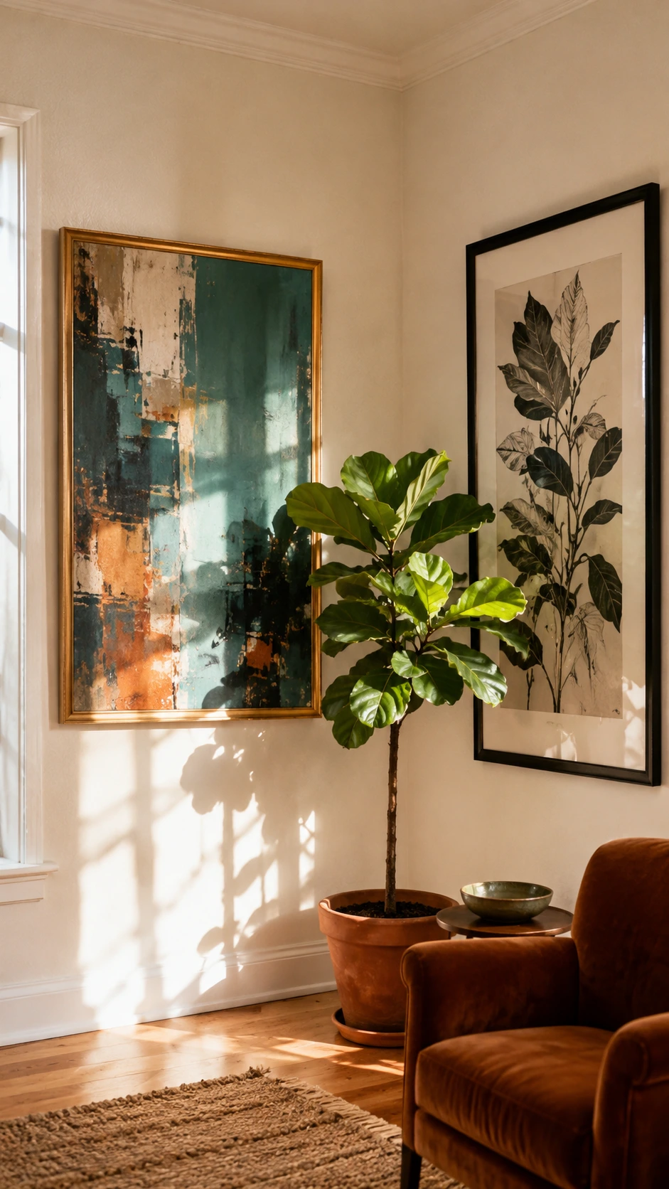
The corner only works as a gallery wall if both walls feel connected, not like two separate arrangements that happen to be next to each other.
Picking one larger piece for each wall and hanging them at the same height across the corner is the easiest way to make that connection happen.
It does not need to be a matched set, just something that shares a color, a mood, or a general vibe.
Once those two anchors are up, the rest of the arrangement almost organizes itself around them.
I think most people skip this step and go straight to hanging everything at once, which is usually why corner gallery walls end up feeling chaotic.
2- Use the Corner Seam as a Visual Center
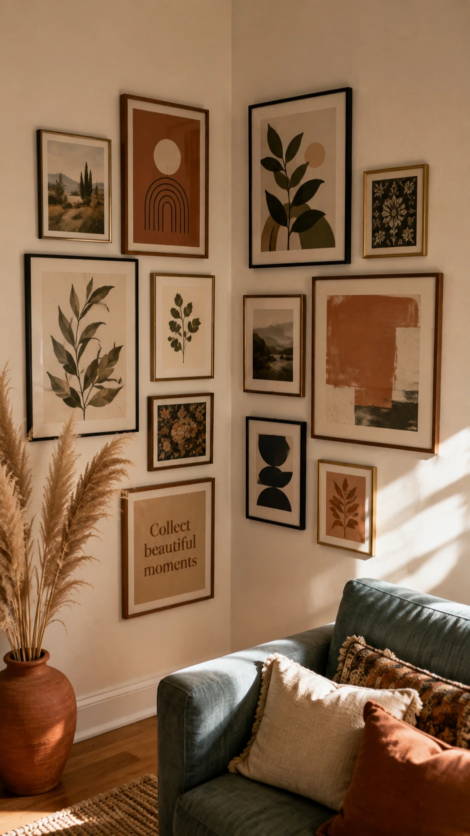
Nobody really thinks about the actual corner seam as a design element, but it is genuinely one of the most useful lines in the whole room.
Treating it like the centerline of the arrangement, and placing pieces symmetrically on either side, gives the whole wall a sense of balance without needing to measure constantly.
This works best when the frames on both sides are roughly similar in size so neither wall feels heavier than the other.
A slightly asymmetric version works too, as long as the visual weight on both sides stays roughly even.
3- Mix Vertical and Horizontal Frames
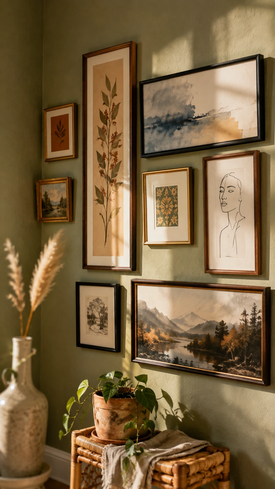
A gallery wall that is all the same frame orientation starts to feel like a grid pretty quickly, which can look a little stiff in a corner setting.
Mixing portrait and landscape frames breaks that up in a way that feels casual and collected rather than arranged.
The corner handles this mix really well because each wall can lean into a different orientation and still read as one cohesive display.
Most of the time, starting with one horizontal piece low and one vertical piece high on opposite walls is enough to get the rhythm going.
4- Include Something Three Dimensional
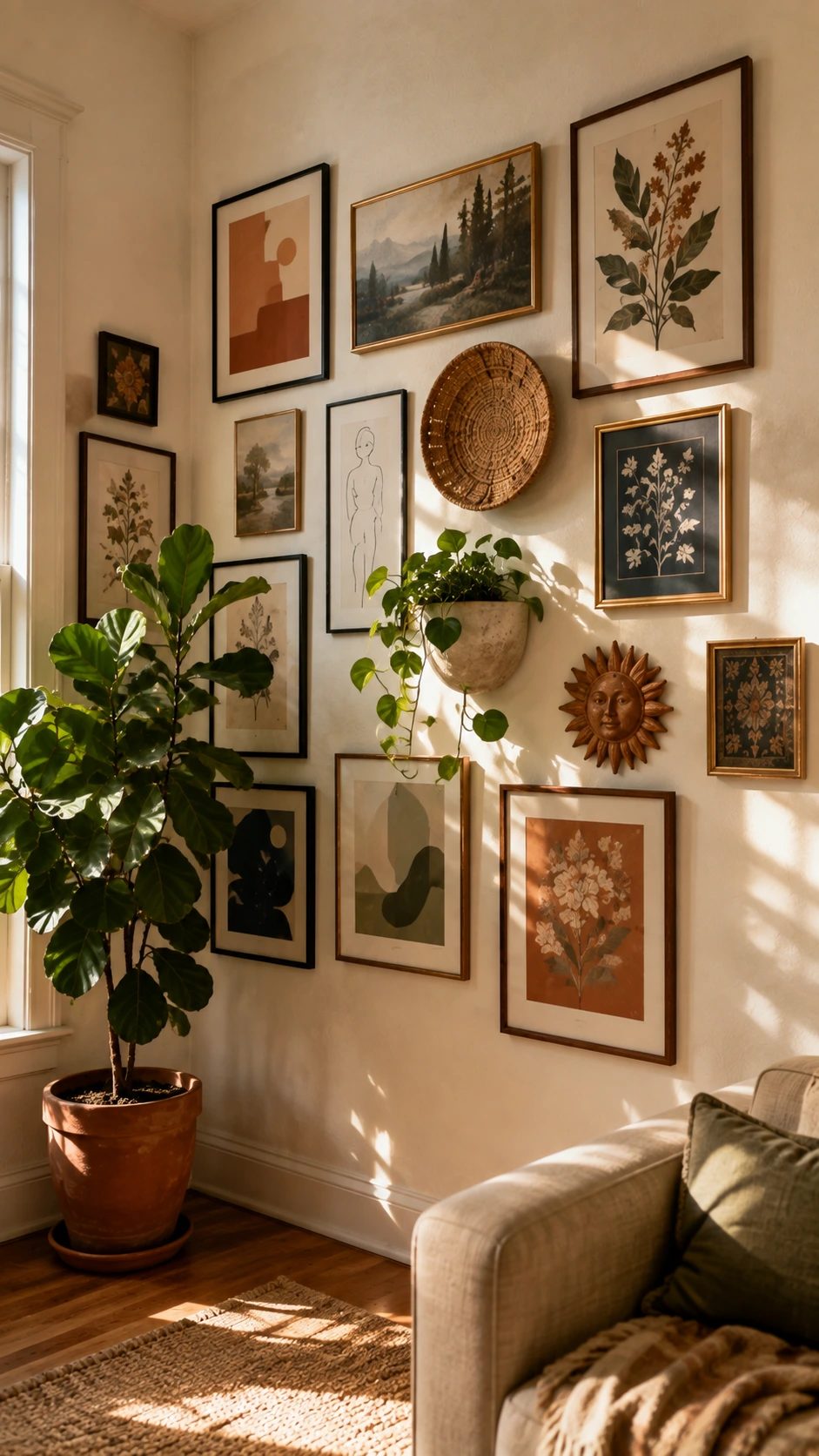
Flat frames everywhere can start to feel a little one note, especially in a corner where the eye is already being pulled in two directions.
Adding one or two things with actual depth, like a small shelf, a woven basket hung flat, or a sculptural wall piece, gives the arrangement some texture to rest on.
It does not have to be elaborate or expensive, just something that breaks the flatness for a second.
Corners are actually great for this because the surrounding frames give the three dimensional piece something to anchor against visually.
A single small floating shelf with one object on it can do more for a corner gallery wall than three extra frames would.
5- Let the Arrangement Wrap Loosely Around the Corner
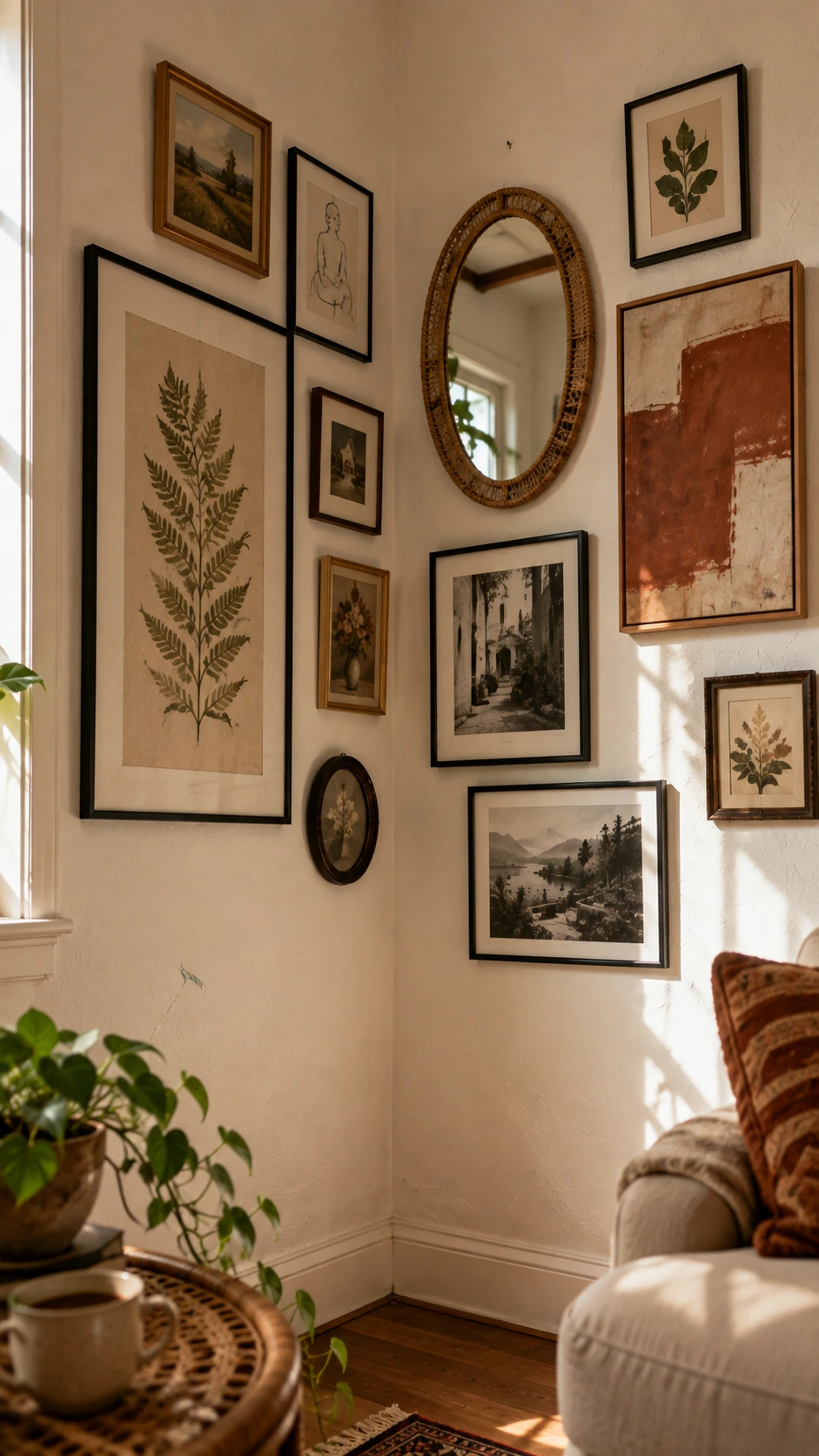
Some of the best corner gallery wall setups do not stop hard at the corner seam, they let a frame or two drift past it onto the other wall in a loose, organic way.
This makes the whole thing feel less planned and more like it grew naturally over time, which is usually the goal.
The key is to not mirror it perfectly, one or two pieces crossing the corner line is enough without making it look deliberate.
Leaving a little breathing room between the frames that cross the corner keeps it from feeling crowded in the most visually busy spot of the arrangement.
6- Stick to a Limited Color Palette for the Frames
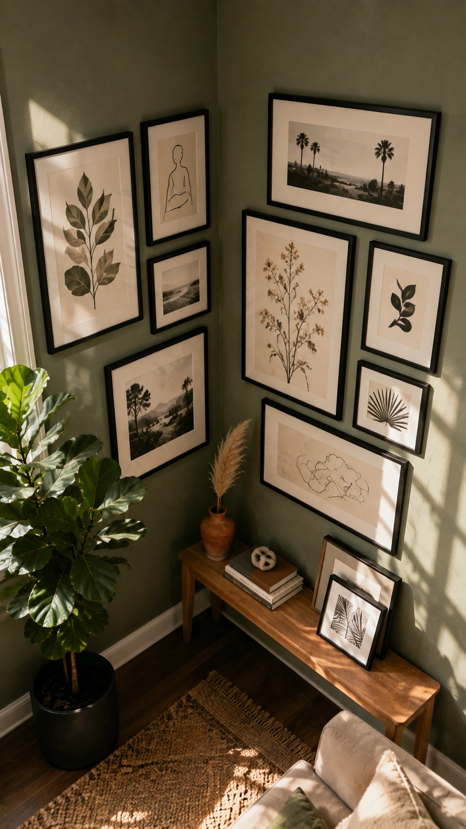
Frame color is one of those details that does not seem important until the whole wall is up and something feels off for a reason nobody can name.
More Ideas to Love
Keeping frames within two or three finishes, like black, natural wood, and white, pulls a corner arrangement together without making it feel matchy.
This is especially useful in a corner because the eye is already moving across two walls and a consistent frame palette gives it somewhere to rest.
Mixing too many frame finishes in a corner setup tends to read as messy rather than curated, which sounds like a small thing but makes a noticeable difference.
That said, one intentional outlier frame in a completely different finish can work really well as an accent if everything else is consistent.
7- Use Leaning Pieces at the Base of the Corner
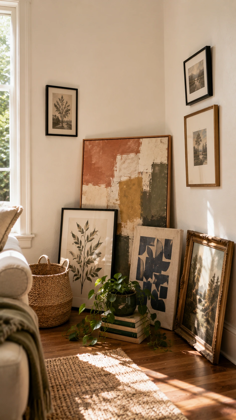
Not everything in a gallery wall corner needs to be hung, and leaning a few pieces against the wall at the bottom is one of the easiest ways to fill that lower space without committing to more holes.
A large leaning print, a framed canvas propped against the baseboard, or even a small collection of framed photos leaning in a row all work well here.
This works especially well in corners that already have a console table, a bench, or even just a floor lamp sitting nearby.
The leaning pieces give the whole arrangement a relaxed, layered feeling that hung frames alone do not quite pull off.
8- Scale Up in the Corner Itself
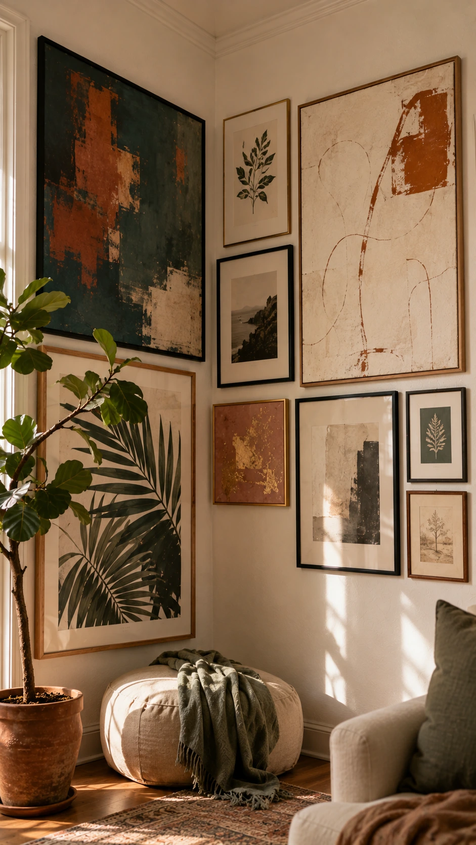
One of the most underused gallery wall corner ideas is simply going bigger right at the corner point, where the two walls meet.
Placing the largest piece of the whole arrangement directly at or just beside the corner seam draws the eye inward and makes the whole display feel intentional rather than scattered.
Most people instinctively put their largest pieces in the center of a flat wall, so putting it at the corner feels counterintuitive at first.
Once it is up though, it tends to make the corner feel like the focal point of the room rather than the afterthought it usually is.
9- Add a Small Plant or Trailing Vine Into the Mix
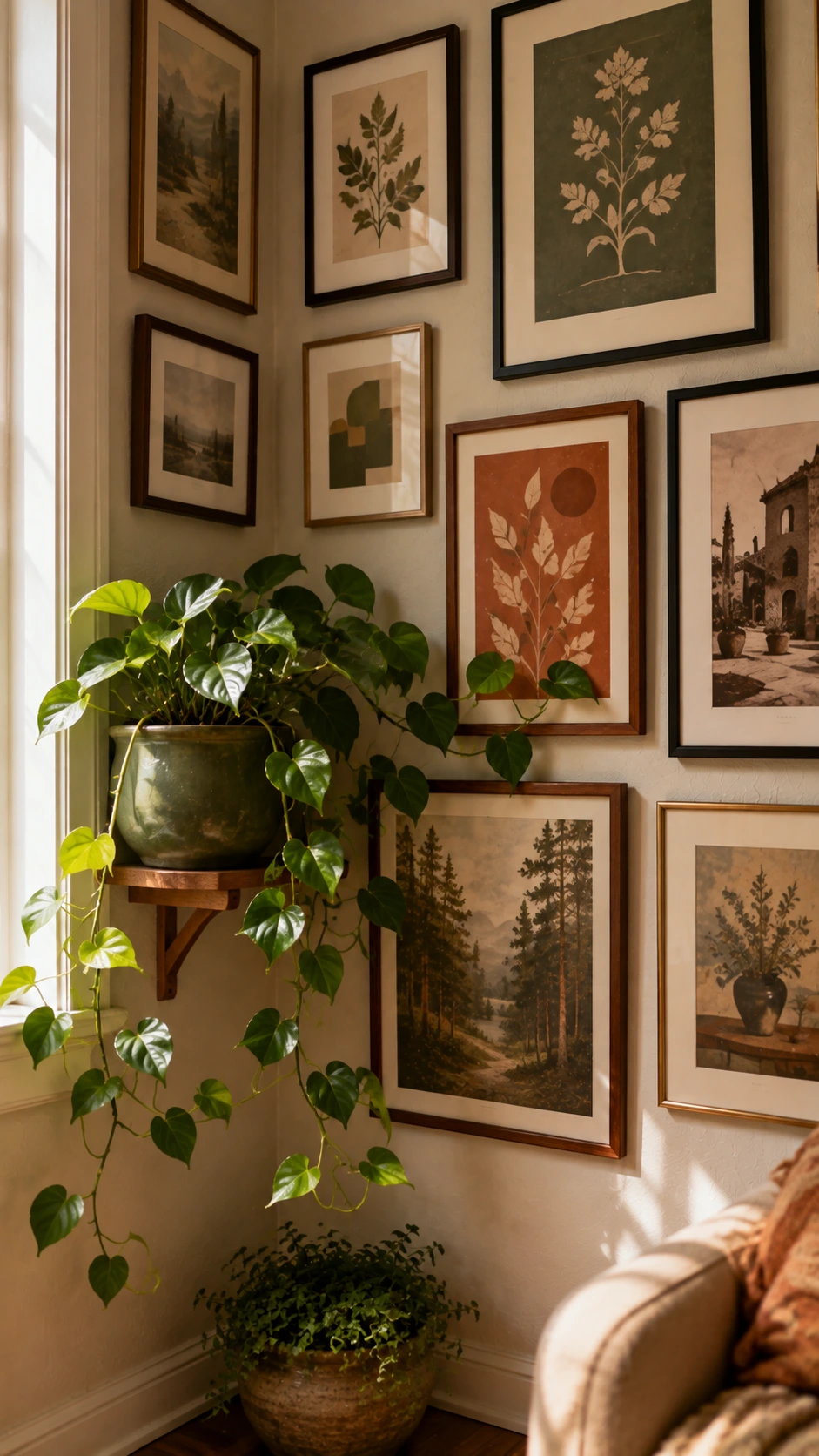
A corner gallery wall that is all frames and no life can start to feel a little heavy, especially if the frames are dark or the art is dense.
Hanging a small plant or weaving a trailing vine across part of the arrangement softens the whole thing in a way that no frame can replicate.
A small hook with a hanging pothos or a trailing string of pearls along the top edge of the arrangement is usually enough to do the job.
This works best when the plant is not competing with the art but just grazing the edges of it, like it found its way there naturally.
Keep Reading
It also helps the corner feel like it belongs to the rest of the room instead of sitting apart from it.
10- Plan the Layout on the Floor First
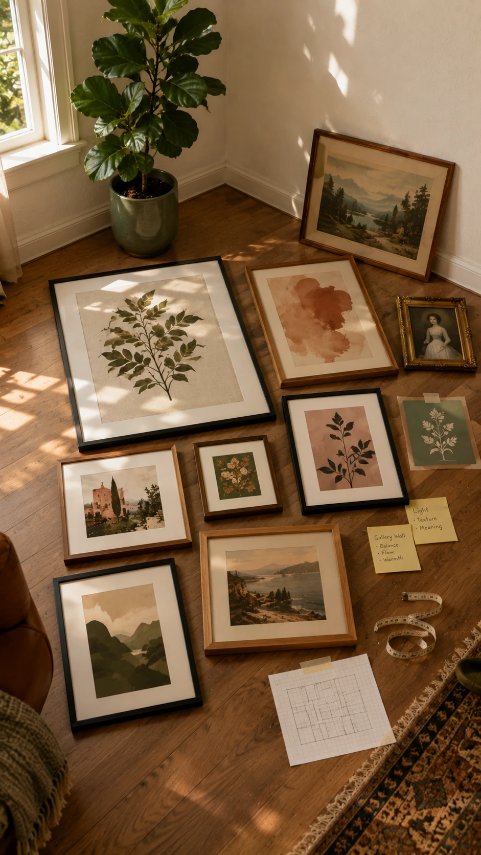
Corners are trickier to plan in your head than flat walls because the angle changes the way the eye moves across the space.
Laying everything out on the floor in the rough L shape of the corner before picking up a single nail is one of those steps that sounds tedious but saves a lot of patching later.
Arrange the pieces on the floor the way they will sit on the walls, and stand back to look at the spacing and the overall shape before committing.
Adjustments on the floor take seconds and adjustments on the wall take considerably longer, which is always a nice reminder to do it this way first.
Once the layout feels right on the floor, taking a photo of it gives a clear reference to work from while hanging.
Gallery Wall Corners Are Easier Than They Look
Most corner spaces sit empty not because there is nothing to put there but because it feels more complicated than hanging things on a regular flat wall.
The ideas here are all things that work in real rooms without needing a lot of tools, a big budget, or a perfectly curated art collection.
Starting with just two anchor pieces and building outward slowly is usually all it takes to get going.
A corner that used to feel like dead space ends up being one of the more interesting parts of the room, which is a pretty good return on an afternoon of hanging things.

I am Eleanor Foy, the mom of two behind DaisyHacks. I am a lover of clean, calm homes and a person who will happily spend 45 minutes researching a 5 minute cleaning hack. No regrets.